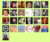
I’d like to say when I was designing the logo for WeTheChurch.org I put a ton of thought into it.
The truth?
I had one thought. Knowing that Twitter was going to be a huge part (if not the biggest) of the interaction with the site, I wanted a logo that would stand out on the “friend grid.” I’m not sure what the official name is, but you’ll notice below it’s a grid. Of friends. A friend grid if you will.
Anyway, I wanted the logo to stand out as much as it can in a small form. Most of the icons in the grid are faces. Because of that I wanted an exact circle contrasting with the square icon to draw the eye. Add a simple two-color look and there you have it. Total time, it took about 10 minutes.

i love the design
it certainly does catch my eye amongst all the others in the “friend grid”
Very cool!
part of me wants it louder. the dark blue doesn’t shout at me. the first thing i notice on the screenshot is the futurama guy, then the red circle on white, then the gold/yellow sunset thing two to the left, and then the blue/white WTC.
i think it would be cool if the circle+two color was the mark, but the color’s could change. but that’s just me.
I love it! Sometimes the best ideas take the least time.
We tried a lot of color schemes before settling on this one. For the logo a brighter color would have made it stand out more. However, for the actual site, the brighter colors just didn’t fit at all.
nice work man. very cool. lets hang and do coffee soon.
shalom